Logo and Corporate Identity for a SaaS Company
A professional-looking logo is very important for a software as a service (SaaS) company. A good SaaS logo helps attract new clients by making the company look trustworthy and competent.
My client built a software application called GrainFlow. GrainFlow helps agricultural grain producers in Louisiana and neighboring states maximize their profits. The software application tracks the moisture shrinkage of the grain starting at the moment when the grain hits the tanks.
Industry:
Software as a Service (SaaS)
Client:
GrainFlow
Website:
Coming Soon
Project Details:
Art Direction
Logo Design
Corporate Identity
Case Study: Drafting and Decision Making
Below is a summary of my design process from start to finish. All in all, you can see my design decisions and maybe understand how I ended up with the final result.
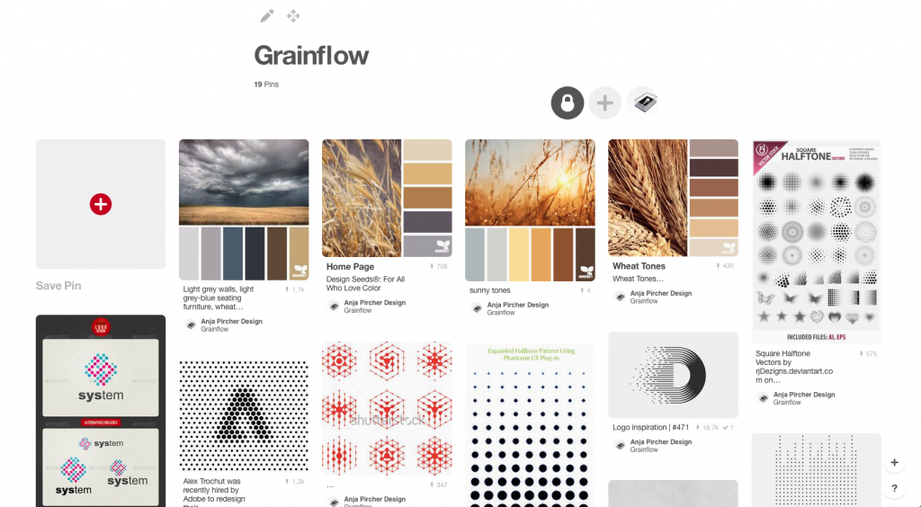
When I start a new design project, I create a Moodboard on Pinterest. Collecting inspirational images helped me fuel the design ideas I had for this project.
My client Bill wanted the logo to highlight the crop flow and communicate the shrinkage of the grain. Considering Bill’s ideas, I came up with some first drafts.
I ended up presenting him with only the strongest concepts that had the most variations. From there, we quite quickly decided on one concept that I fine-tuned to the final file (shown below).
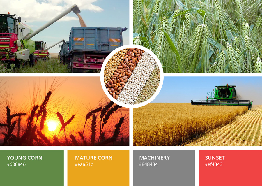
Moodboard for the Corporate Identity Colors
We decided to use green and gold as primary colors. Green stands for the young plants that, over time, turn into mature golden crops that are ready to be harvested.
Furthermore, we introduced two secondary colors consisting of a soft grey and red. Grey symbolizes the machinery that the farmers are working with. Red is reminiscent of the hot sunsets in the southern states of America. This is the region where most of GrainFlow’s customers are. Red is also a highlighting color in the software application itself and on the website.
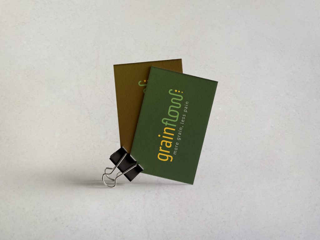
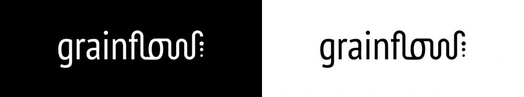
The Finished SaaS Logo Design
In the final analysis, we decided that the logotype with the connected letters represents GrainFlow the best. The user can easily see what the logo is about, especially when supported by the slogan ‘less pain more grain’.
The tube at the end of the word ‘GrainFlow’ symbolizes the unloading of the grain into a tractor trailer. The three dots are of different sizes and stand for the shrinkage of the grain when it loses moisture.
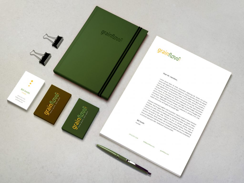
SaaS Corporate Identity
The corporate identity includes the letterhead, business cards, and notebooks.
In conclusion, this was a very fun project for a great product that helps farmers get more profit out of their grain.