Logo Refresh for a Tech Conference
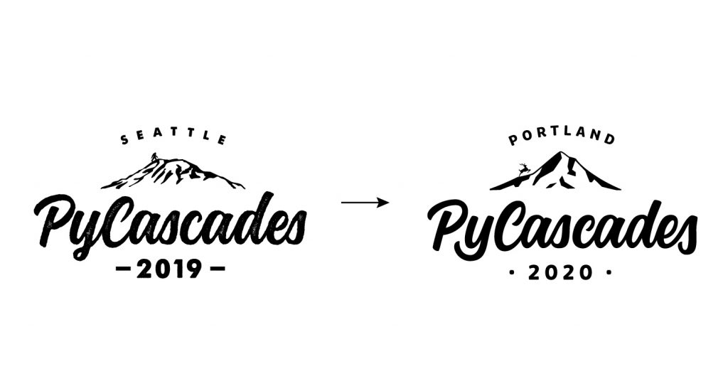
Sometimes, after a few years, it’s time to update a logo. To do a logo refresh is a less dramatic approach and means that existing design elements get slightly improved. Check out the makeover below that I made for PyCascades, where I improved the typography and added new design elements!
PyCascades is a regional Conference about the programming language Python in the Pacific Northwest. Every year the conference takes place at another city, celebrating the west coast Python developer and user community. Thea from PyCascades contacted me if I could to the logo-refresh this year for the conference in Portland in 2020.
Since I’m familiar with the Python community, I already knew the PyCascades logo and liked the overall look. I was looking forward to working on the logo refresh – that meant optimizing the logo, but maintaining the look that the community loved and already knew.
Industry:
Software Development
Conference
Client:
PyCascades
Website:
2020.pycascades.com
Project Details:
Art Direction
Branding
Lettering
Illustration
Same but Different – Requests for the Logo Refresh
The main requirement was to maintain the same branding style, but to update the lettering and the mountain to something Portland-specific. The problem with the current logo was that the logo had a rather heavy texture. For example, the texture and the lack of clean contours made laser cutting very difficult. This is something that Thea had a hard time with in the past when working on various conference items.
Going into Detail with the Logo Refresh
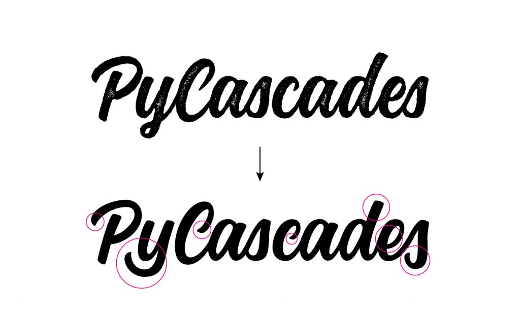
The main focus was on tracing the current font to create a clean logotype. In doing so, I corrected the spacing of the individual letters and optimised some of them.
- Here are some details I’d like to mention:
I’ve made the terminals (end of any stroke) of the letters uniform to simulate the natural brushstroke - I’ve change the descender of the letter ‘y’ to fill the empty space between the letters ‘P’ and ‘y’
- I shortened the ascender of the letter ‘d’ to make the logotype more compact
- The letter ’s’ at the end, I made slightly larger to go below the baseline. This way, the logotype looks more balanced
Primary Logo Refresh
It’s always good to have different logo options for different applications.
For a conference it is especially useful to have various logo options to create various promotional products.
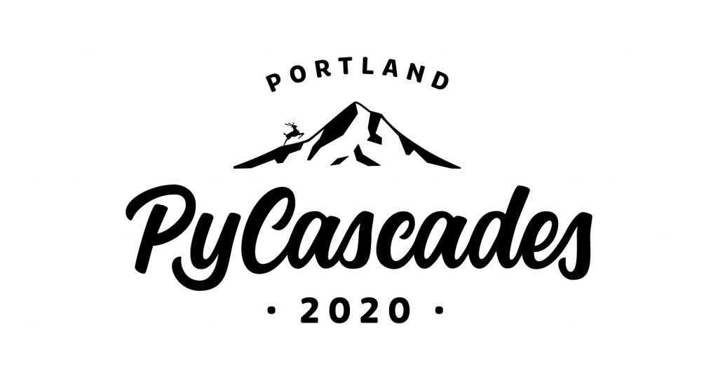
The primary PyCascades logo contains key information from the current conference: the year and the new location. This logo is the most familiar to conference participants. It is the official stamp of the PyCascades conference.
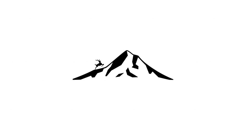
The PyCascades 2020 conference will be held in Portland. Mount Hood is Oregon’s highest point and a striking landmark. For this reason the mountain-icon features Mount Hood. I made it based on photos of Mount Hood, seen from Portland. To add even more Portland character, I’ve added the deer of the famous “The White Stag” sign, also known as the “Portland Oregon” sign.
Secondary Logo Refresh
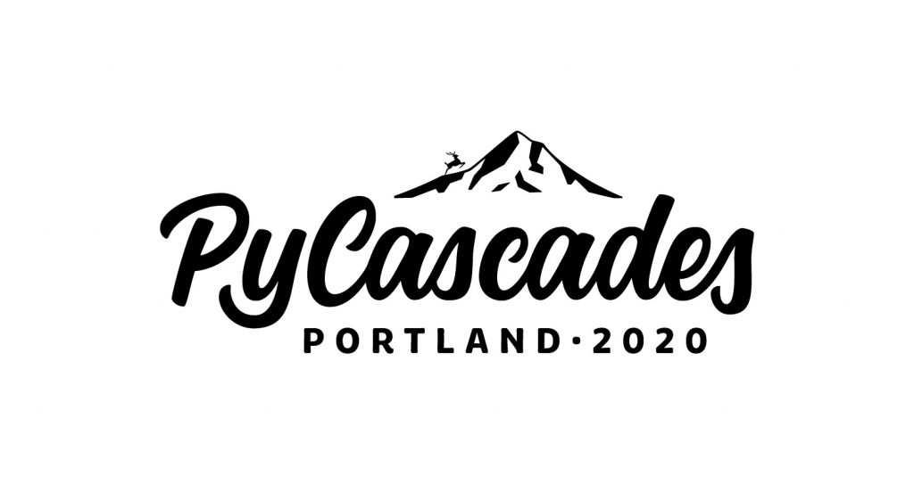
PyCascades did not have a secondary logo yet. However, it is very useful to have one, especially if space for the design is limited. This logo is smaller than the primary logo, but still contains all the necessary information.
Logo Icon Refresh
The icon of Mount Hood with the deer is very iconic for the 2020 PyCascades conference. It can be used as watermark or for various small promotional items such as pins or stickers.
Conference Stickers – The All Time Favorite
Conferences are always hub for promotional items and gifts. In particular, stickers are very popular with software developers. Decorating laptops it basically part of the culture. Keeping that in mind I created a logo alternative for this.
Conference T-Shirts – The All Time Second Favorite
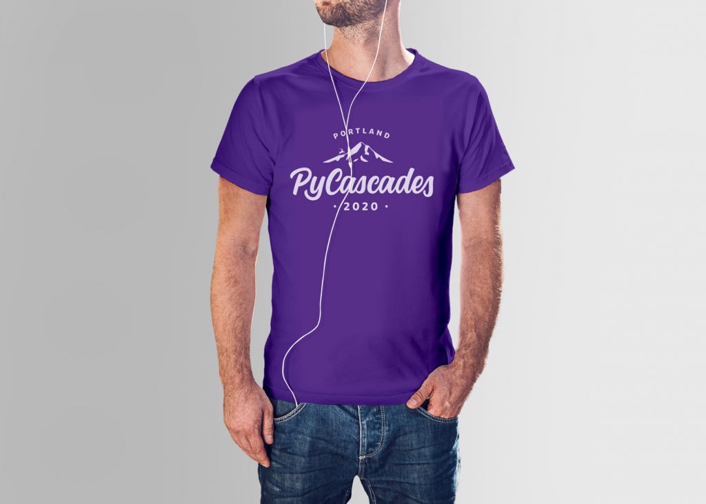
The second most popular conference swag of all time is the t-shirt. Wearing the t-shirt outside the conference is always a nice reminder of the time you spent with the community. Seeing someone in the wild wearing the same t-shirt you have, is definitely fun too!
Don’t forget the corporate identity refresh
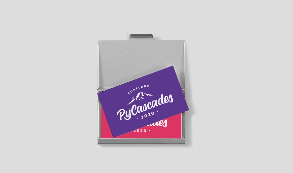
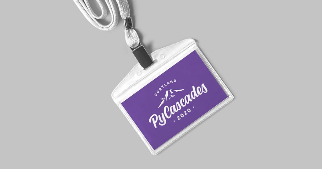
When doing a logo refresh, it is very important to update the entire corporate identity. Even for a conference, a consistent branding across all channels is crucial. From business cards and banner to web design and online presence, everything should speak the same design language.
