This Is What A Stampin’ Up! Demonstrator Logo Should Look Like
Stampin’ Up! is the leader in decorative stamps, handmade greeting cards, and papercrafting. Their products are made available through a network of independent sales consultants called “demonstrators.”
For a demonstrator, there are three keys to standing out amongst a sea of competitors: fiery passion, fierce dedication, and a unique Stampin’ Up! demonstrator logo!
My client Steffi possessed all of these keys, and it’s what helped her skyrocket to becoming one of the top demonstrators worldwide. After a few years of running her business, Steffi wanted to redesign her current logo. Her new Stampin’ Up! demonstrator logo brings her already successful business to the next level.
Industry:
Art & Craft Products
Client:
Stempelwiese,
Stampin’ Up! Demonstrator
Website:
www.stempelwiese.de
Updated website coming soon
Project Details:
Art Direction
Branding
Social Media Template
A Desire For A New Design
Steffi and her husband Helmut contacted me because they wanted to redesign their current Stampin’ Up! demonstrator logo. A couple of years ago, they got their first logo through 99designs. While the design met their criteria, pretty soon they figured out that it was not versatile enough for their needs. What’s more, the designer of the logo was no longer available to make any changes!
Steffi could have gone back to 99designs for a new logo, but she would not have found the unique elements she was looking for. Unfortunately, many of the submissions for her first logo design looked exactly the same.
This is a huge problem for demonstrators. If one person is setting a trend, then others are sure to follow. That’s why almost any Stampin’ Up! demonstrator logo you see will have watercolor elements, floral designs, stamp icons, or even the same handwritten font!
Steffi wanted something to help her business stand out. She wanted a timeless design that would never go stale; one that was so unique, nobody could copy it.
I’m happy to say that I was able to give her just that!
So, how was I able to take a tired design and turn it into a fresh, bold statement of originality? Keep reading to find out!
Old Logo Design:
- Standard handwritten font
- Too thin and hard to read
- The logo is fragile and weak
- Unnecessary details
- The design is interchangeable
New Logo Design:
- Custom, handwritten logotype
- Bold logotype, easy to read
- Confident and strong logo
- Design-details, tailored for the brand
- Unique design that nobody can copy
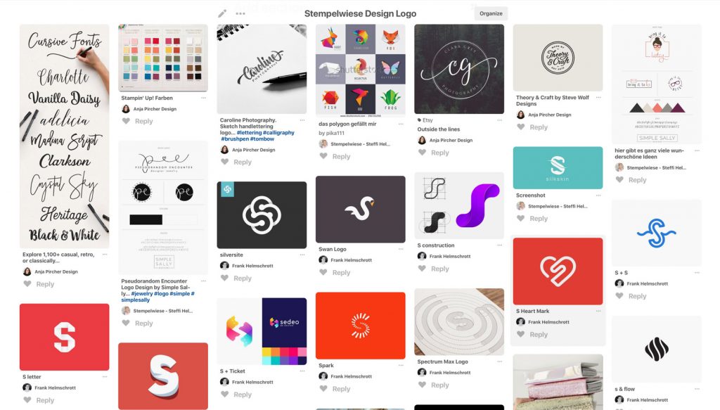
Brainstorming A Vision
The first step to any design project is brainstorming: collecting ideas, styles, and fonts that should be part of the final design. My clients already had a pretty clear idea of what they wanted:
- The brand name “Stempelwiese” should be hand-lettered. That meant all letters would be hand-drawn by me.
- The letter “S” should be used as some sort of icon. An icon is a very handy tool to use for smaller spaces, or even as a watermark or favicon for a website. The letter “S” was chosen because it stood for Steffi, Stampin’ Up, and Stempelwiese.
- There should be floral elements that reflect the word “wiese” in the brand name. Steffi’s business name, “Stempelwiese,” is made up of two words: Stempel (“stamp”) and Wiese (“meadow”).
My clients had other ideas they wanted me to consider, like origami and paper elements (since that is the most used material in the Stampin’ Up! community).
I took all of their “must-haves” and “nice-to-haves” and combined them with their desired goals, applications and target audience. It was time to move on to the design phase.
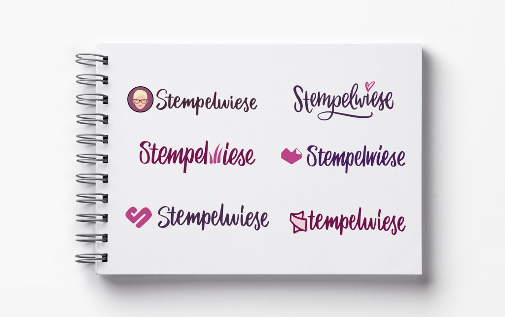
An illustration of Steffi’s portrait as icon, heart-elements and origami inspired -S- shapes.
Ideas Meet Reality
To start, I created multiple concepts and variations for my clients to choose from. I worked hard to turn their ideal logo into a reality, hand-drawing many elements so that they would be completely original. Here you can see the logo design drafts that made it to the final decision round:
Twists And Turns
Not all projects go completely as one would expect from beginning to end. There are usually changes or doubts along the way, and this project was no different.
During the Design Phase, I found that it was quite difficult to pair an icon with a hand-lettered logotype. The brand name “Stempelwiese” was already very wide, and adding an icon to it made the image even wider! I couldn’t find a way to place the icon on top of the brand name without taking away from it, either.
I decided to approach the “icon idea” differently, including a little playful detailing within the brand name itself. I chose to draw the letter “w” in the shape of three blades of grass. This fit perfectly with the word wiese, meaning “meadow.”
I was delighted when my clients agreed to move forward with this new design approach!
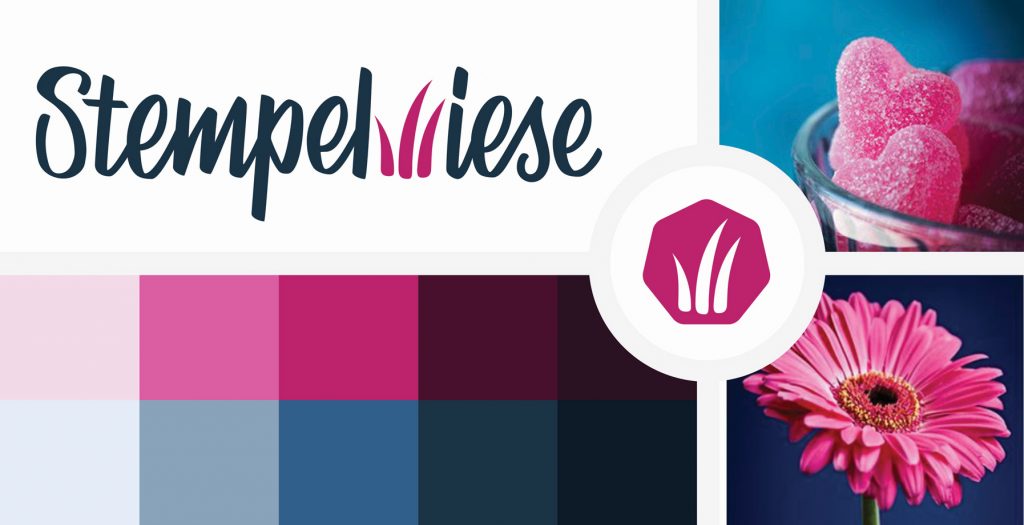
A Touch Of Color
In terms of color, my customers had already made their preferences known. Steffi’s favorite color was pink, and Helmut wanted to have a more neutral color for the website. I chose to keep the lettering in a very dark color to contrast with the “meadow” detailing in a strong, bright pink.
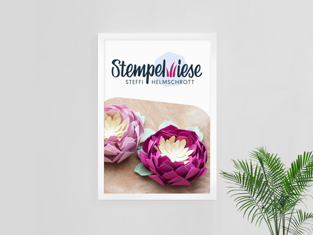
The Final Design
I built each letter of the “Stempelwiese” logo from scratch. Ready-made hand-lettered fonts are abundant, and you don’t want to have something that your competitors are using as well. This is the advantage of having a customized logotype: you won’t come across the same hand-lettering anywhere else.
I did extract the meadow detailing to use as an icon. This was perfect: my clients now had the icon that they also wanted as part of their branding.
Every aspect of this design is truly unique. For example, the meadow icon cannot simply be copied for use in another Stampin’ Up! demonstrator logo. All the elements were chosen because they made perfect sense for this brand.
Primary Logo Design
Secondary Logo and Logo Mark
Getting Social
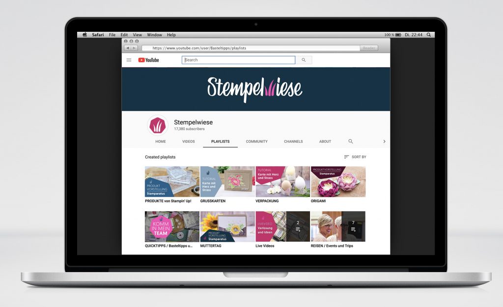
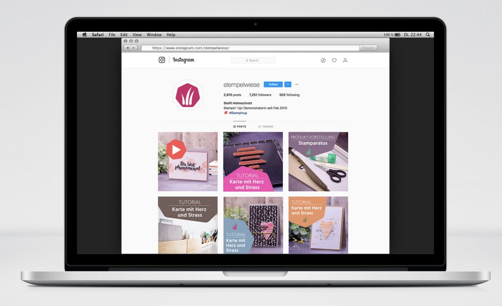
Steffi recognized early on that she would need to use social media to her advantage. She is very active on YouTube and Instagram most of all. So I turned her new branding into customized social media templates that she could alter as needed for her posts.
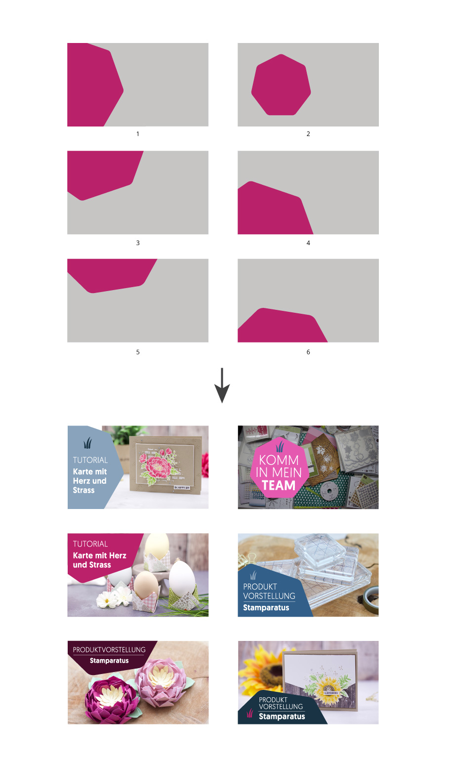
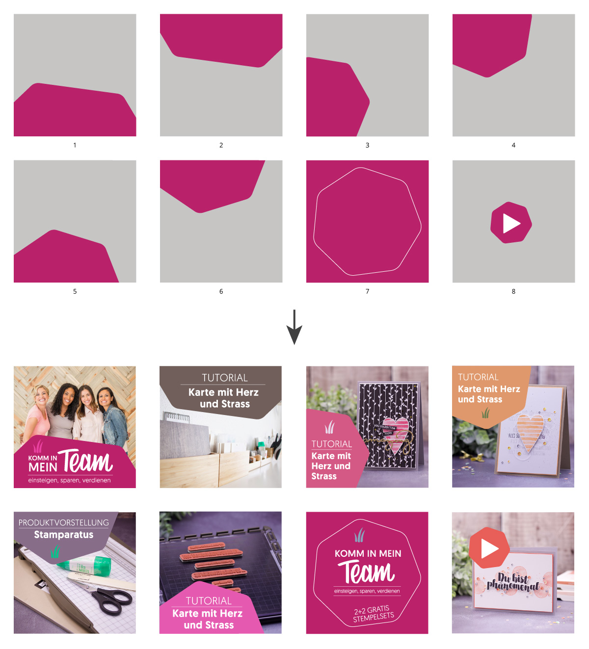
I used the hexagon from the main logo to form the basic shape. From there, Steffi can choose different placements of the shape, and even adjust the colors for each post!
Customised Templates for Youtube
Customised Templates for Instagram
I had a super fun time working with Steffi and Helmut to update their Stampin’ Up! demonstrator logo! My clients were very grateful for such an original design, and I was happy that I could give them everything they wished for.
If you’re ready to get started on finding a fresh and unique design for your brand, then click below to book your free design consultation!