Minimal Logo Design for an Architecture Firm
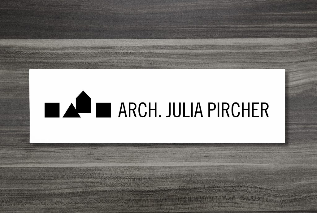
I created a minimal, modern logo for my architect sister, Julia. After several years of professional experience, she opened her own business, and naturally, she asked me to design her logo.
Julia gave me only one condition: To represent her architecture firm brand identity in the best light, she wanted to keep the design black and white, making her modern architecture the center-stage of her brand. I knew this was going to be a fun project and started right away.
Industry:
Architecture & Design
Industry:
Arch. Julia Pircher
Website:
juliapircher.it
Product Details:
Art Direction
Branding
Illustration
Moodboard/Art Direction
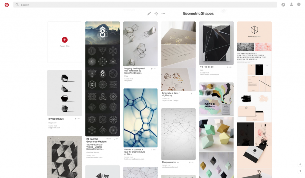
It was clear that the logo had to be geometrical. To begin with, I created a board on Pinterest and gathered images with structural shapes for inspiration.
First I spun my head around complex, delicate, outlined shapes. But soon I literally went back to square one—to the good ol’ regular shapes like the triangle and square. I started to see little houses in each shape. Lining them up, they reflected a residential area in a playful, yet elegant way. The logo immediately tells the story of what the company is about in a very subtle way. In black and white, the logo is a real eye-catcher and makes a bold statement.

Minimal Logo Leads to Clear Corporate Identity
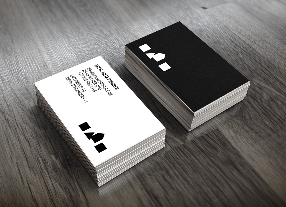
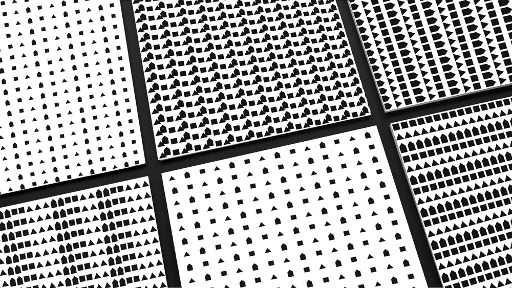
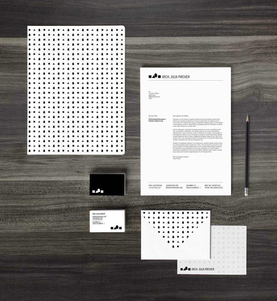
The logo should continue to put Julia’s architecture center-stage—clear structures, minimal, and strong. The logo is also ideal for designing different patterns. I used these for some printing materials like the backside of the invoices or notebooks.
Seasonal Greetings
Every year, we create a special Christmas greeting that Julia can send out to her email list and post on social media. For that occasion, I modify the logo with some graphics. I’ll be adding a new edition every year, so stay tuned!
