You Won’t Fur-get This! Equine & Canine Massage Therapy Branding and Design
The key to standing out from competitors is a consistent and professional brand. Lisa thought the same thing when she started her business.
Lisa is a licensed Registered Veterinary Technician, certified in therapy and body work for our canine and equine friends. Her business, called Kaneqt, is where she uses her gift of touch to provide care to companion animals, sport animals, and seniors in palliative care.
If you look closely, you can see the words “canine” and “equine” in Lisa’s brand name. It’s a fun play on words that literally “connects” the two fields: Kaneqt!
I absolutely loved this idea and was very happy to work with Lisa on her new branding and design.
Industry:
Health + Animals
Client:
Kaneqt
Website:
kaneqt.ca
Project Details:
Art Direction
Illustration
Branding
Webdesign
Brainstorming For A New Brand
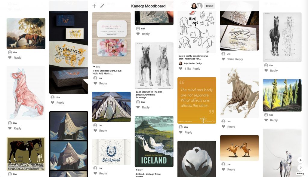
We started the design process with brainstorming and cataloging our ideas. I created a Pinterest mood board to collect typography examples, colours and styles.
Mood boards are a great tool to use for collaboration. They help the client to visualise their thoughts and ideas, and give them that first “look and feel” for their new branding design.
A Touch Of Color
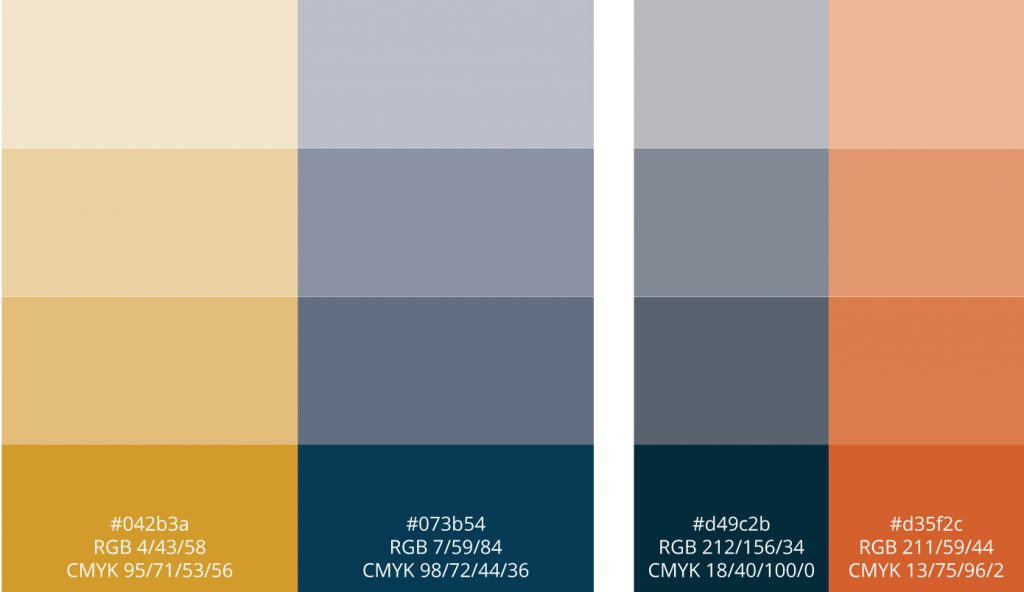
After testing several different color combinations, we decided to go with a dark blue as main color, with a gold tone as the highlight color.
Traditionally, the color blue is associated with feelings of reliability and trustworthiness. Gold, cousin to yellow and brown, can convey love and compassion.
Such a muted color combination is an ideal choice for a business in the alternative healthcare sector!
What’s It All About? (Primary Animal Massage Logo)
A logo should be flexible enough for use in many different applications. To this end, it’s important to have a wide variety of logo formats one can work with.
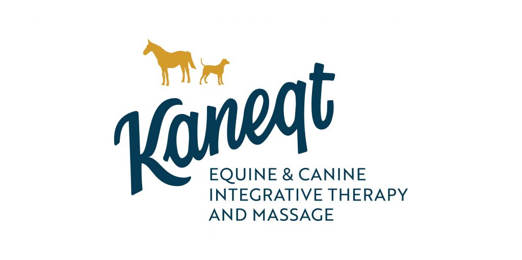
The primary or main logo is the one that will be most familiar to clients. This is the official stamp of your brand, and contains all the visual information anyone would need to recognize your company. As such, the main logo will have more visual elements than, say, a secondary logo.
I created the word mark by hand and completely from scratch. (That means just me, my pencil, and my imagination!) There is a large advantage to having a customize logotype, and it’s this: you simply won’t come across the same hand-lettering anywhere else!
I added a hand-drawn icon of a horse and a dog to give viewers a direct reference to what Kaneqt is all about—working with dogs and horses.
The primary logo also shows the slogan, which describes the business in more detail.
Word Up! (Secondary Animal Massage Logo)
I decided to have the word mark alone act as the secondary logo. This type of logo should be used when the larger context already describes the essence of the business fairly well. (For example, on a website or a leaflet.)
Iconic Logo Icons
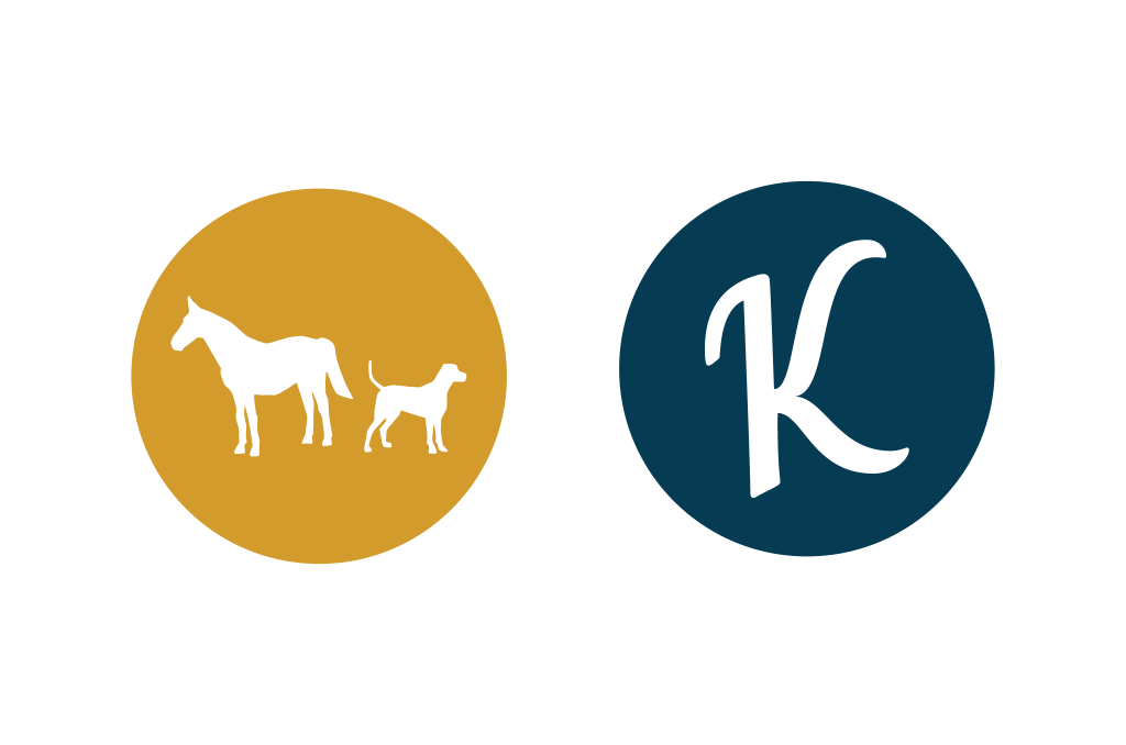
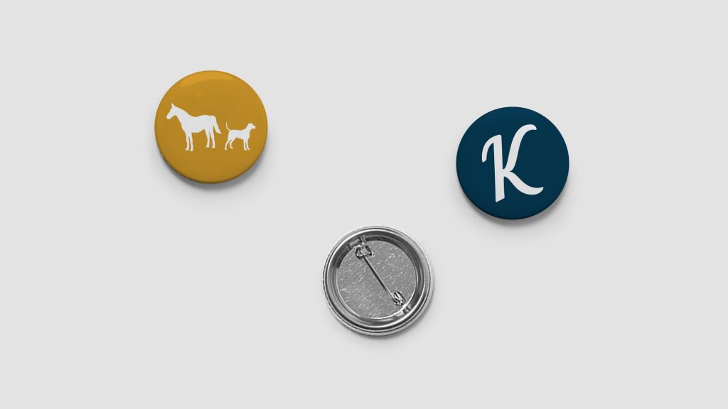
For Lisa’s business, I created two icon options to choose from. The K-icon will be mainly used as brand. For instance, watermarks and website favicons would do well to showcase this icon.
The second animal icon can be used as a decorative element for various promotional materials.
Minimal Animal Anatomy Illustrations
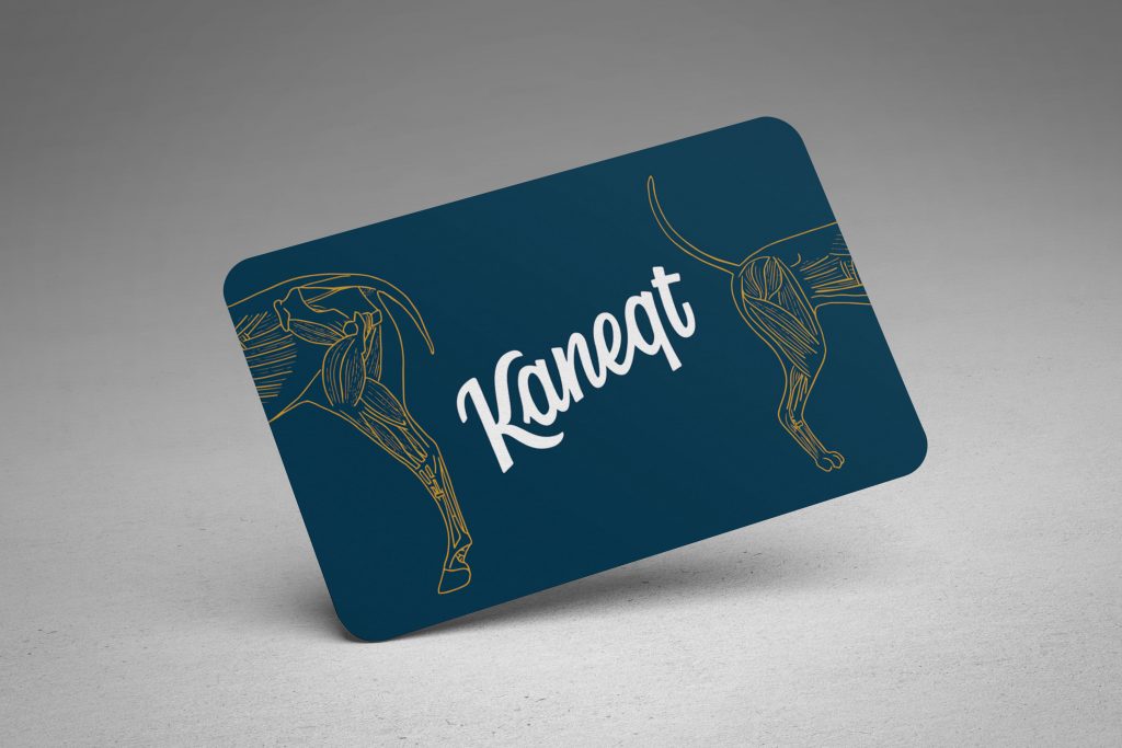
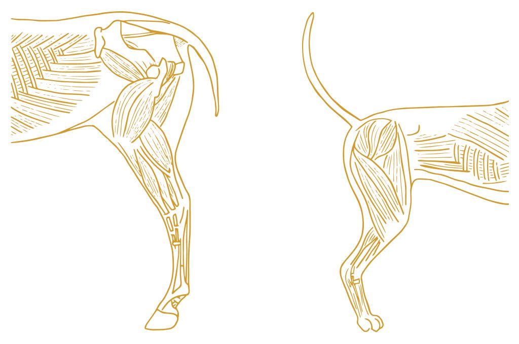
While working on the mood board, I discovered that Lisa is very much into vintage animal anatomy drawings! I wanted to make sure to include this preference in her new branding as well. So, I created a minimal muscular drawing of a horse and a dog.
These drawings reflect the main focus of Lisa’s canine and equine integrative therapy and massage business: working on muscles and myofascial tissue.
A Consistent Corporate Identity
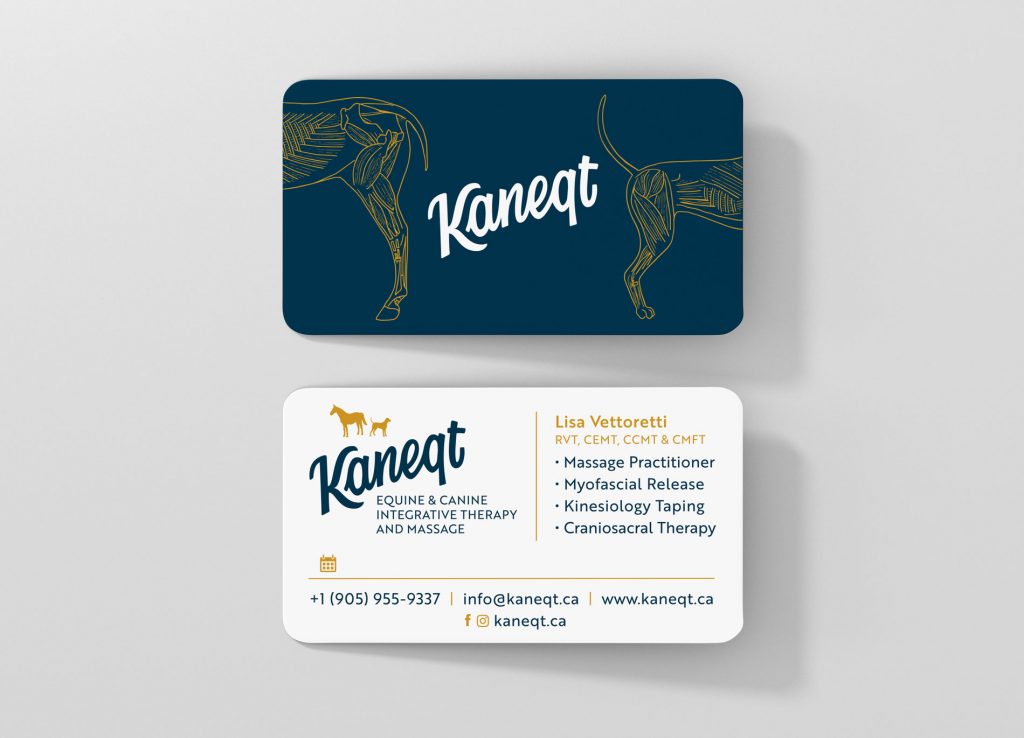
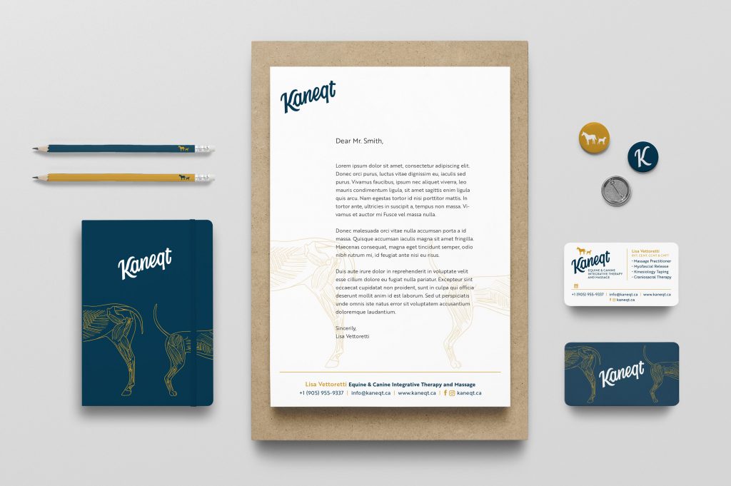
It’s crucial for any business to have consistent branding across all available channels. With this in mind, I developed a full spectrum of stationery to showcase Lisa’s new corporate logo. These included business cards, letterheads, and various other promotional materials.
Stand Out With A Roll-Up Banner Stand!
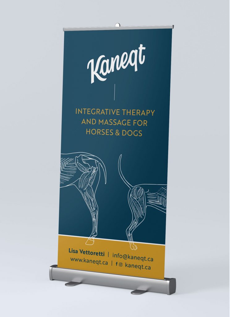
A roll-up banner stand is handy to bring to any event, presentation or meeting. You can use this form of portable advertisement anywhere you want to get your message across.
Banner stands are easy to transport, and there’s no assembly required—you can set them up in seconds! They’re great for both indoor and outdoor advertising, as they can be moved around at a moment’s notice. Roll-up banners are a simple tool for speaking directly to your target audience.
Stickers—More Than Just Advertising!
Stickers have been around for a long time, and for good reason. They’re the perfect tool to easily label and brand absolutely everything: from products and packaging, to equipment that you use for treatments. Whether handed out in person or sent through the mail, high-quality stickers are considered more as a small gift than just advertising.
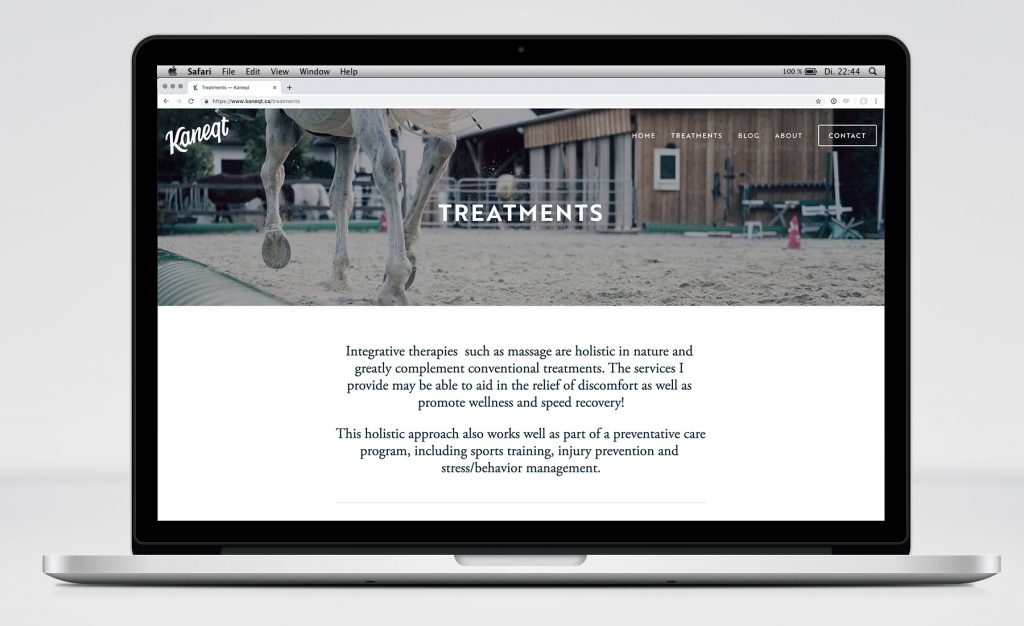
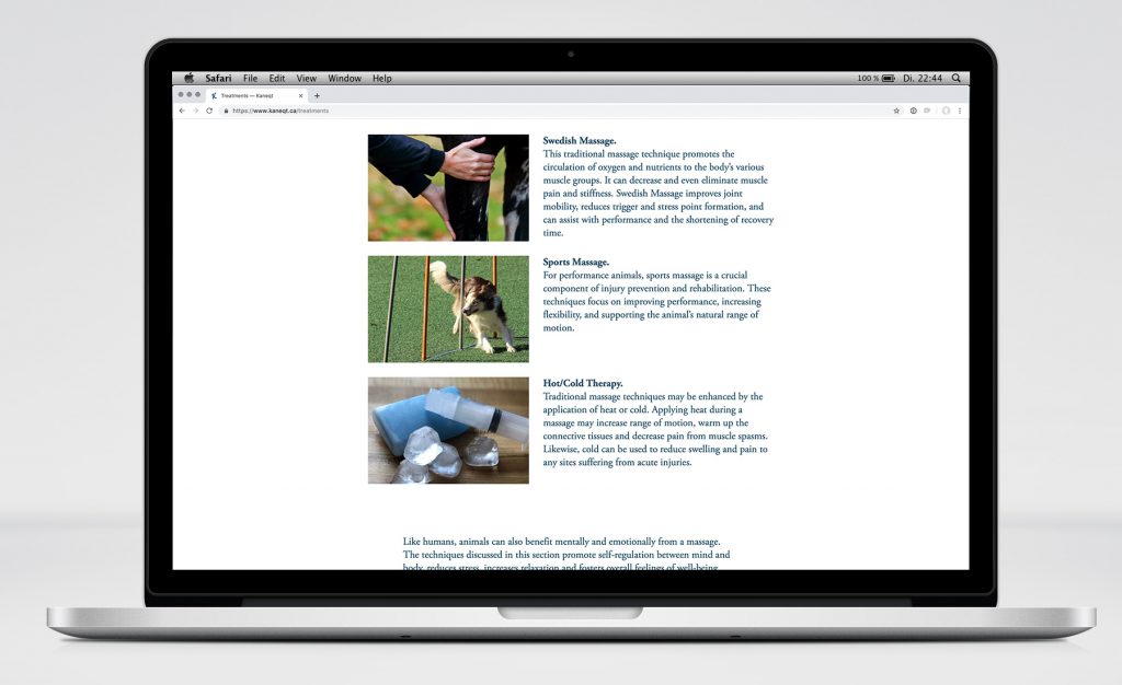
The Final Website Design
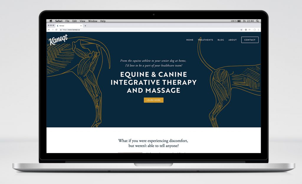
I created Lisa’s website using Squarespace, which would allow her to easily make modifications on her own in the future.
My logo brought my business to life. I didn’t want a generic clip art – I wanted something that spoke to my clients and expressed who I am as a business owner.
I had a hard time with focusing myself on the tasks at hand, I really didn’t know where to start and how to go about getting things going. Anja not only provided me with that focus but also provided me with support. She taught me so many things I didn’t know about my own business.
Anja more than exceeded my expectations, she was amazing. I am extremely happy, as her aesthetic was a perfect match for what I wanted for myself.
My experience of working with Anja was pleasant and extremely rewarding. I learned so much from her and can not wait to collaborate with her in the future!
— Lisa Vettoretti, Owner of Kaneqt
