I wanted to make a landing page banner for my website that communicates what my services are about—services that make your brand shine. I hand lettered my slogan to create a friendly welcome for the page viewers.
Drafting and Decision Making for My Landing Page Banner
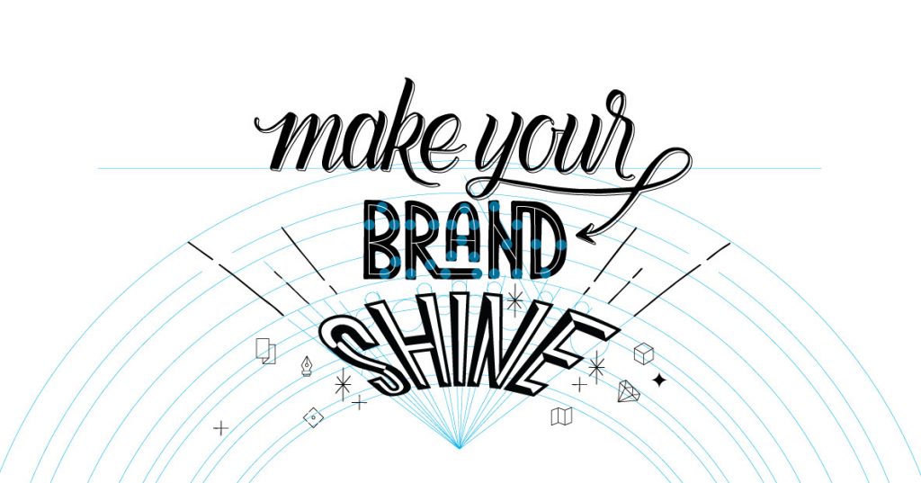
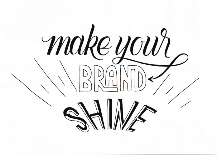
Every lettering project starts with some layout sketches. When creating these sketches, there are three key questions to answer before diving in. Answering these before you start will help you reach the goal quicker.
1. What’s the format? Is the design for a poster or a web banner? For packaging or for an Instagram post? It’s very helpful to give yourself some guidelines to make sure the artwork fits the purpose. You see I skipped this step at the very beginning of this project. Even though I had the website banner in mind, I started doodling right away. I could have avoided one step by framing out the artwork area first.
2. What’s the hierarchy of the words? You can either create a hierarchy by making keywords bigger than others or by using different font styles and weights. For this project, I decided to use different font styles and colors. I wanted to communicate the range of possibilities in how customers can make their brand shine.
3. What’s the tone of the message? By only looking at the artwork and without reading the copy, you should get already the feeling of what it’s about. Is the message friendly or harsh? Will it be playful or structured? Modern or retro? Loud or quiet? You see? There is a lot to think of…
Decorative Elements
At the end of a lettering project, you can decide if you want to add any decorative elements—either to fill in some gaps, to highlight certain words, or to beautify the artwork even more.
The purpose of this landing page banner is to direct the user to the website content below. Not only the word shine, but also the sunburst elements guide the eyes further down.
Digitize the Slogan
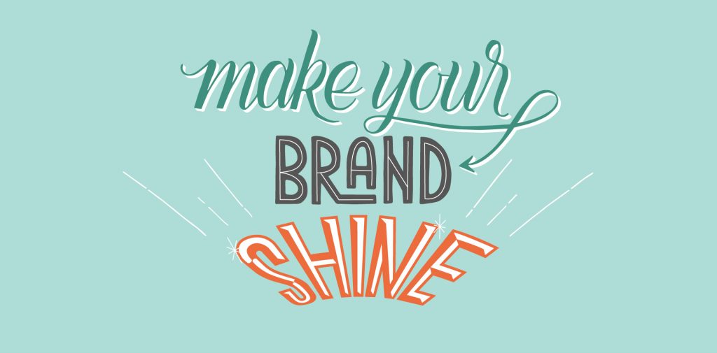
When I’m happy with the draft, I scan it and then vectorize it in Illustrator. Having vector artwork makes it easy to mix and match different colors.
Considering the tone is very important when choosing colors. My banner should be friendly and inviting. Pastel teal not only communicates that, but it’s also one of my favorite colors at the moment.